The State of Sustainability Initiatives Review is a massive report, created every four years, by the International Institute for Sustainable Development, one of Talk Science to Me’s oldest clients. We were asked to copy-edit, design and proofread this epic masterpiece, weighing in at 365 pages. The design portion of the project, with its more than 400 figures, tables and images, was mine.
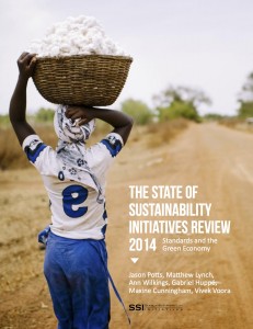 The SSI report, which evaluates voluntary sustainability initiatives in 10 major agricultural crops, is a massive undertaking of research and writing, and my task was to honour the content and create a logical, readable, accessible—i.e., well-designed—version for our client’s readers, which include experts in the field, laypeople and the media.
The central problem in the design process, which had to be completed—including working with the proofreader—in about a month, originated from a seemingly non-design-related question: who was providing content, and when were they delivering it?
Solve that problem well, and the report would be better designed for it.
Coordinating teams
To complete this project, we had to coordinate and assign tasks to multiple teams, spread across two continents and nine time zones, to build out both the content and form of the report. In conjunction with the client’s pre-existing structure, no fewer than eight teams were involved:
- end client
- intermediary client
- content writers
- content editors
- web managers
- printers
- graphics team
- design team
Talk Science To Me was the hub of this network. From a communications perspective, we used a variety of tools to inform, change and approve the report, from live Google Docs to Gchat transcripts to Skype conferences.
With so many involved, it was important to remain productive while merging simultaneous production lines, rather than following a linear step-by-step from, say, writing to design to final report. Design decisions, technical hurdles and content had to be tackled at the same time.
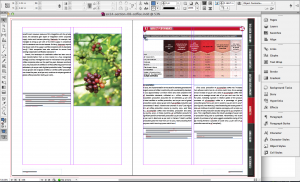
Example: one of Talk Science’s contributions was the collection and use of specific and relevant imagery to illustrate the report. Talk Science’s editorial assistant, Krista Smith, reviewed the primary content themes and began building a database of imagery—both the image files themselves and a meta-tagged database with item or activity depicted, size of image and licence restrictions—collected from multiple sources while I built out placeholders for them rather than waiting for the finals.
As the designer, when I encountered a particular section in need of aesthetic or punctuated imagery, I could sort the shared online database and tag my file for image insertion later. Content discussing palm oil extraction? I could choose from depictions of the refining process, a palm oil farmer or the plant itself. If the image wasn’t available, I could continue building out the design while our assets researcher would hunt for a suitable image.
Another team on the client’s side provided a large collection (300+) of vector-based information graphics. We established both file and higher-level naming and format conventions: the former because inevitably a project of this size balloons in revisions, and keeping track of files requires a robust naming scheme, both on the file directly and in higher level team communications: Are we discussing a figure or a table graphic? Do you mean the MS Word page number or the PDF revision page number? The latter, through the use of vector-based graphics, meant we could scale and edit graphics as the project matured, as content was added or deleted, or as the layout template changed. We weren’t stuck with a proprietary format (i.e., MS Word) or a rigid one, such as JPEG, or more complicated PDF assets.
Design management
As a designer, my priority was determining the best way to manage the report’s digital assets:
- 300 figures and tables
- 60 photographs
- 400+ content documents and revisions
A design build of this scope is never static; the very tools that allow us to work remotely and quickly, and build digitally, also allow for more accessibility: more people can provide input, last-minute changes and format suggestions. Manage this well, and our small team can produce a report that’s more refined and higher quality.
Example: “many cooks in the kitchen” is generally a scenario to avoid in design, but more eyeballs contributing to, and inevitably reviewing, the report meant more errors could be spotted. But rather than distribute those edits across multiple channels, we funneled them through our focused team, where I could then quickly correct and re-export them without recreating the entire report or even individual chapters.
We used MS Word’s built-in versioning system (Track Changes) as a master content repository for the multiple writers and editors involved. Everyone has varying degrees of technical ability and software comfort zones—but everyone has a basic understanding of MS Word. Rather than bring the clients into a particular versioning system or a new software learning curve, all content was built and shared across the old fashioned multiple, but standardized, Word docs. With the contributors comfortable in a native software package, I used a number of specific tools in design software (InDesign) to import and format the content into a series of templates I had built simultaneously.
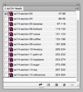
A second key to managing so much content input was to build the InDesign templates as a series of “chapters” that mirrored the actual chapters of the report. InDesign’s book feature allowed me to build each chapter individually, yet coordinate them across one digital database. Each revision to a chapter could be managed as a discrete unit, while InDesign background processes automatically updated the larger report details: page numbers, figure and table labels, content lists and bibliographies.
By setting a well-templated groundwork—both literally in the design build and figuratively in the team coordination—we were able to handle the inevitable unexpected revisions to both content and form. When we realized the report could be better served and read as both a single composition as well as individual chapters, we could accommodate and export as needed, on the fly.
The key was viewing the design build as a living object, setting its DNA even before content arrived, incorporating changes (to take the metaphor further, the epigenetics of the process) and using the appropriate tools to keep the project fed and watered to maturity—i.e., toward the final PDF and printing!