The world of e-book publishing today is a bit reminiscent of the World Wide Web of the mid-90s: the possibilities are fascinating, and there’s tremendous promise for new ways of communicating, but the roads there are still unpaved and littered with occasional potholes.

I recently had the opportunity to create an e-book of Christopher Wallis’s Tantra Illuminated: The Philosophy, History, and Practice of a Timeless Tradition, a sprawling scholarly work on the history of early Tantrik thought.
From the outset, I knew this was destined to be an ambitious project. The book itself is very lengthy, with copious footnotes and margin notes—a design that does not lend itself well to the e-book format. In addition, it’s liberally sprinkled with English transliterations of old Sanskrit texts. These transliterations rely heavily on accented characters and diacritics, some of which prove challenging to e-book readers. And it also makes copious use of illustrations, diagrams, tables and charts, many of which have a level of detail that create difficulties for the low-resolution displays on e-book readers.
The project turned out to be far more daunting than I’d imagined, even knowing from the outset that it would likely be more complex than it first appeared. I could easily write a book on the various technical, layout and rendering challenges I encountered creating this e-book (in fact, that might be a good future project!), but we’ll just look at a few of the interesting potholes we encountered on the road to creating the e-book.
A tale of two diacritics
The text in Tantra Illuminated contains significant lengths of transliterated Sanskrit. Sanskrit uses a non-Latin alphabet for which a standard transliteration system called the International Alphabet of Sanskrit Transliteration (IAST) exists. This is the system employed by the transliterations in Tantra Illuminated.
The IAST relies heavily on Latin characters with diacritic marks. Most of these marks are supported by the majority of e-book readers, so I didn’t anticipate difficulty with the transliterations.
I was wrong.
Very early in the process, I discovered that some characters with diacritic marks were not rendering in the Kindle reader application for Windows, though, strangely, they rendered fine in the Kindle reader application for Macs. They also failed to render in some early Kindle devices…but not others.
After some research (and, it must be confessed, a bit of hair-pulling), I discovered that the Windows Kindle app, and presumably the software in some Kindle readers, uses a public domain font as its primary font for accented characters…and this public domain font is missing certain characters. The character ḍ (lowercase d with a dot below), used in the IAST to transliterate the Sanskrit ड, is one of the characters strangely absent from the built-in font. (The Mac has system fonts that include a full set of diacritics, so the Mac version of the Kindle reader app doesn’t have this problem.)
So the race was on to find a solution. I eventually settled on using the typeface Gentium, an open source, freely available typeface specifically designed for multilingual use. Gentium’s Latin variant includes a full suite of accents and diacritics, and it’s freely available without restriction.
I set the text of the e-book in Gentium, and built the font into the file. This solved the problem of some of the characters not rendering in the Kindle version, though in swerving around that pothole I ran into another one.
The first and oldest version of the Kindle format doesn’t allow embedded fonts. Neither does Apple’s e-book reader, iBooks—or, more correctly, it allows them but ignores them. After some additional research, this time with a minimum of hair-pulling, I found solutions to both problems. Amazon has two standards for Kindle files, the older .mobi format and the newer .azw format…though, strangely, only .mobi files can be distributed via Amazon’s publishing platform, even though Amazon recommends the newer format. This is because a .mobi file is not necessarily a .mobi-formatted book; the .mobi file can also be a wrapper for the newer format, or even contain information necessary for both the older and newer format. (If that’s as clear as mud, well, that’s often how life is when dealing with Amazon.) When we produced a .mobi file with both the older and newer file formats built into it, the file rendered fine using the embedded typeface.
The issue with Apple’s iBooks fortunately proved simple to fix. IBooks uses the ePub format natively, but with proprietary extensions (where have we heard that before?). One of these extensions is a file called META-INF/com.apple.ibooks.display-options.xml, an XML file that contains instructions to control the way the e-book renders in iBooks. Adding this file to the e-book and adding the lines
<?xml version=”1.0″ encoding=”UTF-8″ standalone=”yes”?>
<display_options>
<platform name=”*”>
<option name=”specified-fonts”>true</option>
</platform>
</display_options>
to the file resolved the issue of iBooks not using the embedded font.
With the problem of rendering the text resolved, I was on to the other challenges in the book, like the redesign of the margin notes.
It’s the design, stupid
It is a fact not often acknowledged that e-book design is a design process, just like any other piece of design. Often, e-books are an afterthought to a printed book; the designer merely exports the print version’s InDesign file as an ePub and hopes for the best. In, say, a novel, which may have a very simple structure, that often works well enough. e-books are different from print books in that the e-book reader controls the flow of the text, but for books with a simple structure, that’s not a problem.
For complex scientific, technical or academic work, however, the e-book poses a range of design challenges that need to be solved.
E-book pagination cannot be assumed to be static. Because the e-book reader will modify text flow to fit the size of the screen, the orientation and the user’s preferred type size, the designer can’t make any assumptions about where page breaks might appear. In addition, Google Play does some highly creative (and, quite frankly, slightly bizarre) behind-the-scenes mangling of an e-book’s format, about which I’ll talk in a later post. This means the designer can’t rely on a static page layout. The design must accommodate reflow, text resizing and differently sized screens.
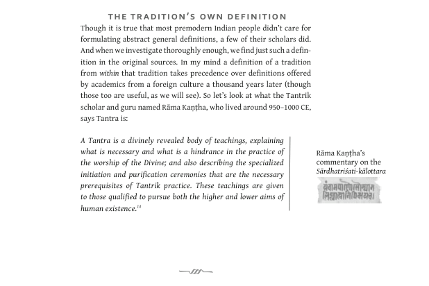
In the case of Tantra Illuminated, it was clear from the outset that the design of the print book, with its wide margins and copious margin notes, would not work. I worked with the author to rewrite some of the text, bringing the margin notes into the body of the text wherever possible. In some cases, this required rewording the text to make the content of the margin notes not seem intrusive or disruptive to the reader.
The print version of Tantra Illuminated also used stylistic and typographic elements to set quotes and Sanskrit transliterations. In the print book, these conventions were different on recto and verso pages; on an e-book reader, there’s no equivalent of recto and verso pages. E-book designers also face constraints in the typography and page layout available to them, as e-books are based on HTML and CSS, which are not always friendly to complex page layouts.
I created a simplified style for quotes and transliterations that preserved the feel of the book’s style in a universal and consistent way, unifying the recto and verso styles to create a single style that looked good and rendered appropriately in HTML and CSS. This required rethinking the existing design and, in many places, reworking that design to fit the limitations of e-book readers. I created, I think, an e-book that was true to the style of the print book, even though it is not the same design. The images below show a portion of the print book (top) and the same text in the e-book (bottom).
That done, I was ready to face some of the additional challenges, which I will talk about in part 2 of this series.
You can buy Tantra Illuminated: The Philosophy, History, and Practice of a Timeless Tradition in e-book format on Amazon or Smashwords.
Interested in reading more about our work with Sanskrit texts? Check out these posts:
Exquisite Love: From ancient text to e-book
Blogging…with Sanskrit