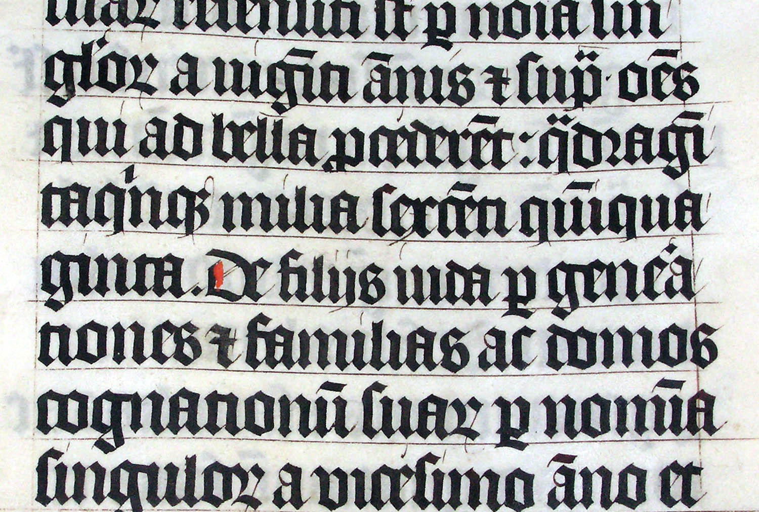
Typesetting and layout aren’t just important to how a document looks. They can also be vital to how easy it is to read. Content creators now have many options for handling these things themselves—everything from default themes in MS Word and Pages all the way up to TeX if you’re in a scientific field. But at Talk Science to Me, we still get a fair amount of work doing typesetting and layout, so I thought it would be worth explaining what you’re really paying for when you hire someone for these services, and what you can reasonably expect to get for your money.
First of all, there’s a lot more to typography than laughing at Comic Sans and hating Papyrus. And while you probably do have some preferences of your own, as Seth Godin points out, “Typography in your work isn’t for you.” It’s for your clients, your review committee, your directors, your shareholders. Professionals spend large amounts of time learning how to make appropriate choices that factor in audience, setting and whatever style requirements are imposed by specific authorities.
This article by Thomas Phinney makes a few interesting arguments for hiring a professional, including some preliminary research suggesting that good typography is more pleasant to read even for non-experts. All of this becomes even more important if you’re integrating a lot of images with your text. Figures and illustrations bring all kinds of concerns with them: placement, size, resolution, style, labeling and indexing—even copyright concerns in many cases. Trying to handle all of this yourself is a little like learning to make your own clothes; if you haven’t done it before, you probably won’t want to wear the result to a business meeting.

If you’re not in the position to hire a real typographer most of the time, then you have yet another reason to invest in a good design style guide. Having clear standards for font, weighting, margins and so on will at least give your documents a consistent look. This is even easier if you create (or hire someone to create) templates for your documents, with all brand-appropriate settings built in. If you’re creating a 300-page report to be tabled before Parliament, writing a book or creating the most important PowerPoint deck of your career, it’s likely worth the money to get the typography done by a pro.
And by “a pro,” I mean us.
